 Traditional
charting methods show price and volume separately and require the viewer
to mentally make the correlation between the two. In the real world,
price and volume are related through supply and demand and this relationship
can be represented on an equivolume chart*.
Traditional
charting methods show price and volume separately and require the viewer
to mentally make the correlation between the two. In the real world,
price and volume are related through supply and demand and this relationship
can be represented on an equivolume chart*.
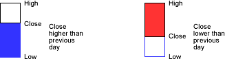
We use equivolume charts to display the behavior of market indexes. An equivolume chart is one in which the range for each day is shown as a bar on the vertical axis, and the width of the bar is relative to the daily volume. We also show if the index closed up or down relative to the previous day by using a color coding scheme.
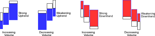
These charts allow a rapid visual assessment of the direction and strength of the movement of a stock or index.
We display the daily volume in the width of each bar by comparing the daily volume to the average daily volume and assigning a value based on the following formula:
 ratio
= daily volume / average daily volume
ratio
= daily volume / average daily volume
ratio =
|
<=
0.5
|
0.6
|
0.7
|
0.8
|
0.9
|
1
|
1.2
|
1.3
|
1.4
|
>=
1.5
|
| bar width = | 1
|
2
|
3
|
4
|
5
|
6
|
7
|
8
|
9
|
10
|
 The
ratio of daily volume to average daily volume is shown below the bar
The
ratio of daily volume to average daily volume is shown below the bar
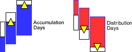
Next we add a symbol indicating if the day is an Accumulation Day (close is up on increased volume) or Distribution Day (close is down on increased volume) by adding a triangle to the close line as shown.
We also add lines for the 8, 21 and 50 day moving averages. Putting it all together we have:
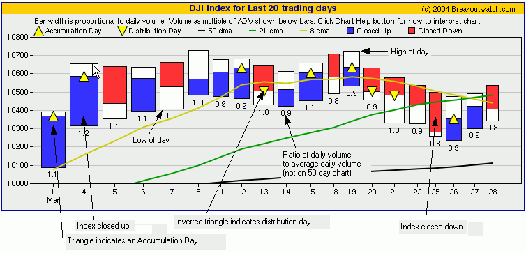
* Equivolume Charts were developed by Richard W. Arms and introduced in his book Volume Cycles in the Stock Market. William O'Neil in How To Make Money In Stocks emphasises the importance of recognising distribution and accumulation days to identify market tops and bottoms. We've combined these approaches in an innovative way to provide a valuable insight into the current state of the markets.